PLEASE NOTE: Joe, is a working name. More research and development is necessary.
THE NEED
After observing that people who lead busy lives are constantly frustrated by "not enough time", I investigated this further to establish their real pain points.
Method: This is generally a cycle with certain steps repeated to gain better clarity on the user's needs.
1. Competitive analysis
2. User interviews to to test my assumptions.
3. Synthesising data to support and form accurate and unbiased personas.
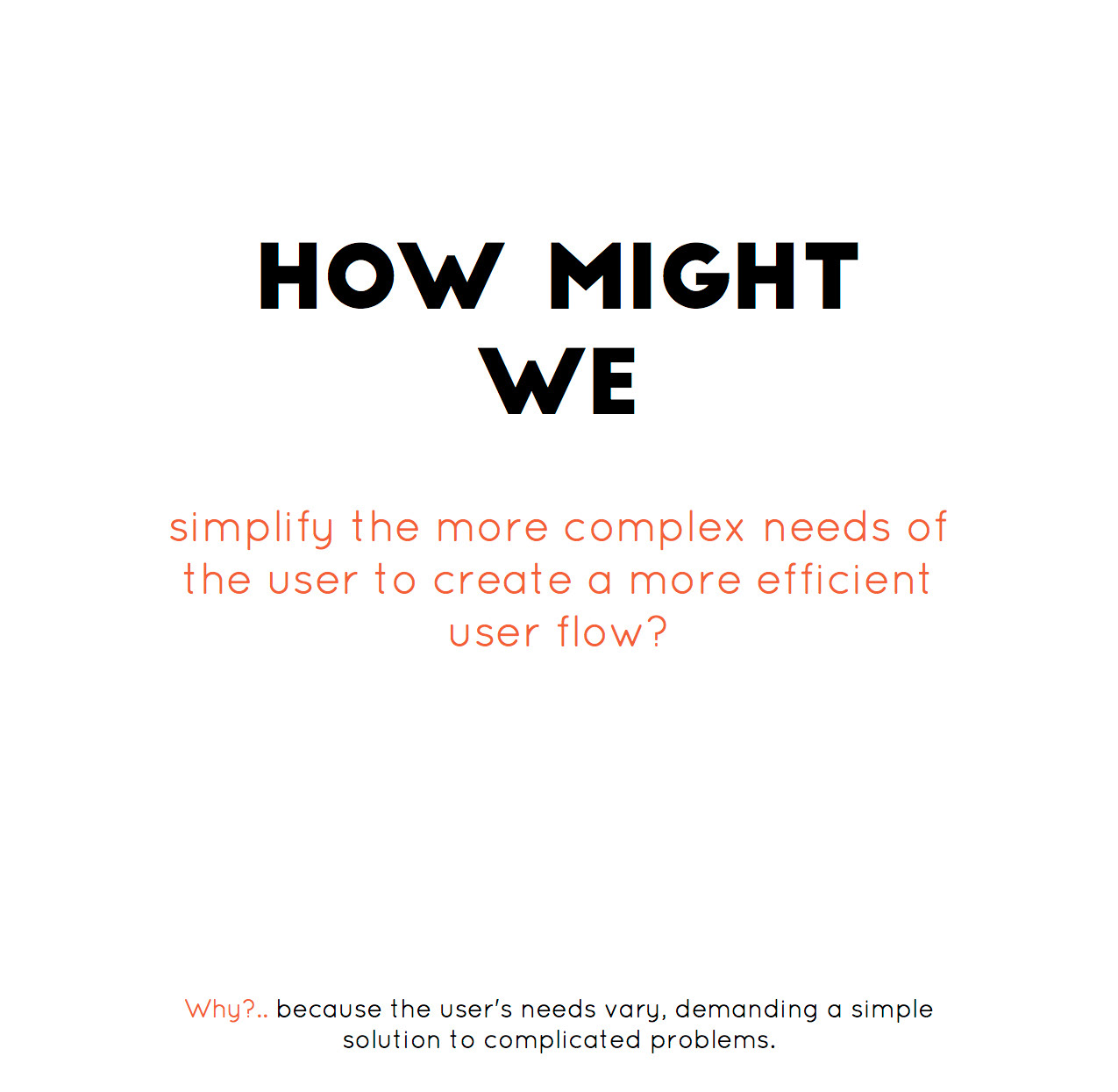
4. Defining user goals - using the "crazy 8" method to find creative solutions and asking "How might we..." and "why?" to challenge my hypothesis and break any pre-conceptions.
5. Prototypes - using user flows, storyboarding, paper prototyping and usability testing to start to understand the user's journey and test initial observations/solutions. I took feedback to inform my designs and create more effective user flows.
6. Feature prioritisation - conducting further user research via methods like 2x2 matrix, dot voting and MoSCW, with an aim to validate what the most valuable and effective features are in the eyes of the users.
Design:
Information architecture and navigation - using open card sorts to inform user flows and site maps.
Wireframing- Taking my research this far and building the pages of my app. I continued to inform these designs with user testing. Thus, Joe.
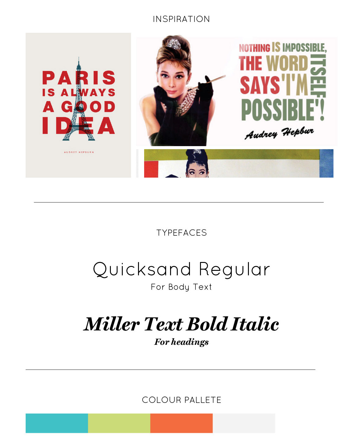
PERSONALITY A - AUDREY
Audrey Hepburn - Bubbly, full of colour and personality. Could use a series of inspirational quotes to help create a personality.
Need to test this and be careful of any connotations this may have.
Also need to be careful and keep it gender neutral.
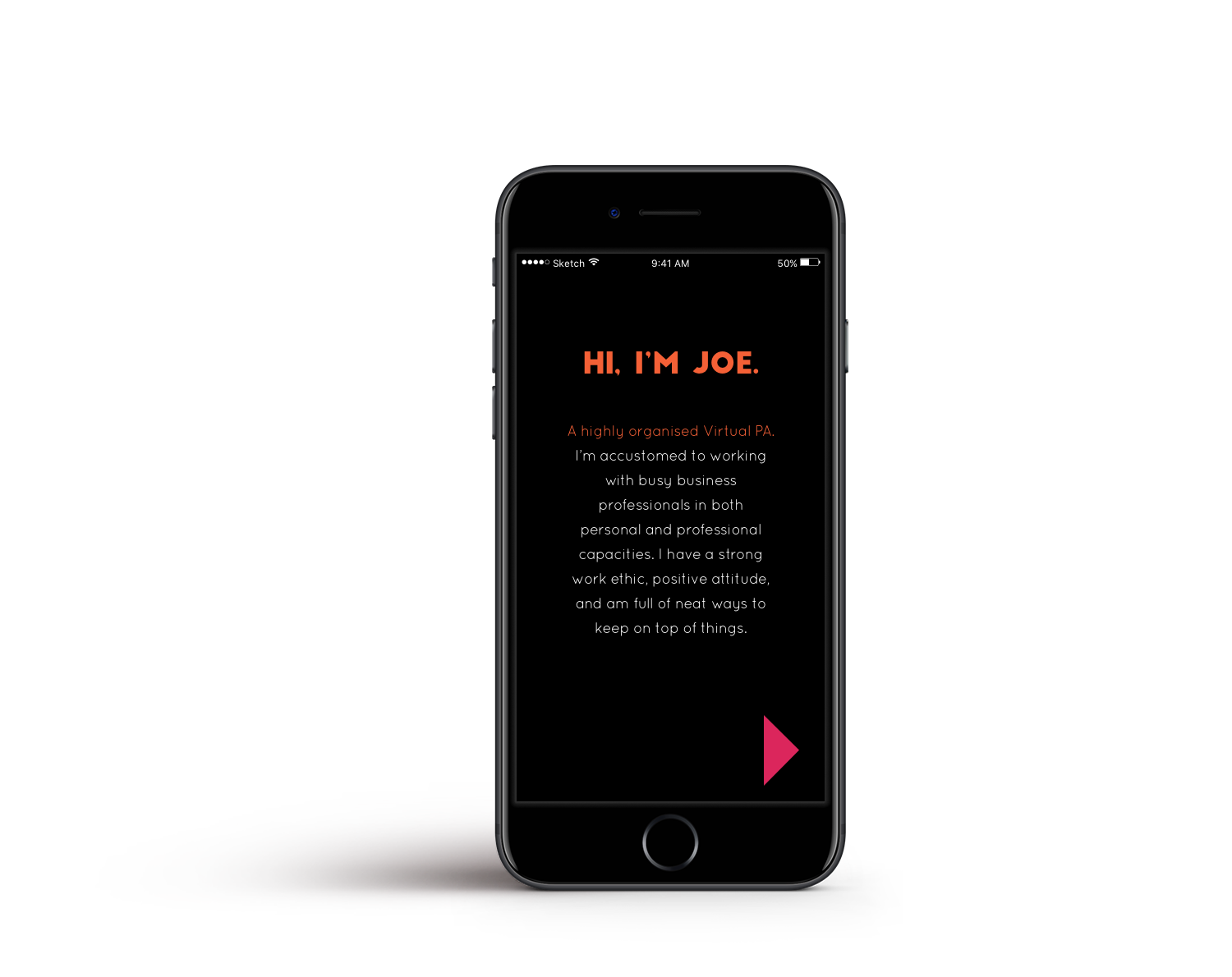
PERSONALITY B - JOE

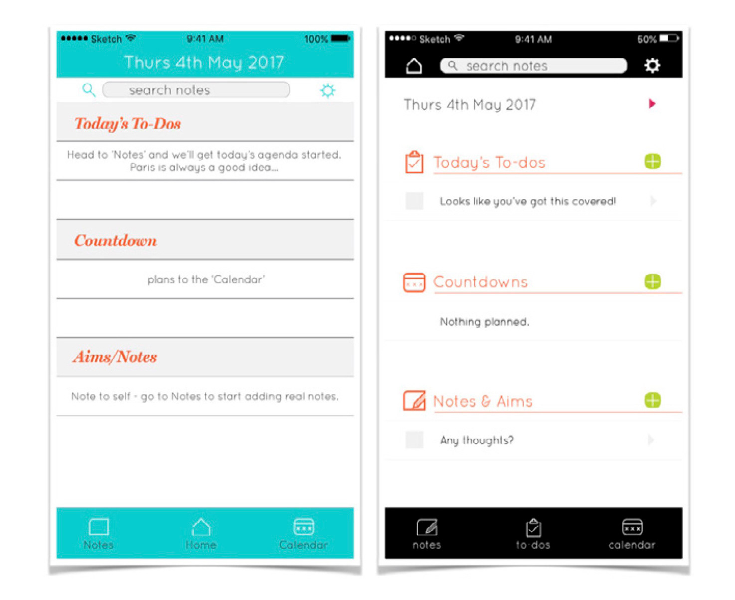
Audrey vs Joe : Home Screen
Need to address many complaints in previous tests about the lack of clarity on the home page.
Users liked the concepts, however seemed displeased by the UI & lack of functionality.
SLOUTION:
- A cleaner and clearer interface.
- Pushed the search bar up.
- Moved the home to the top corner and added to-dos to the bottom menu.
- Created options to add events and to dos straight off the home page.
- Created consistency in labelling with icons.
- Further develop icons.
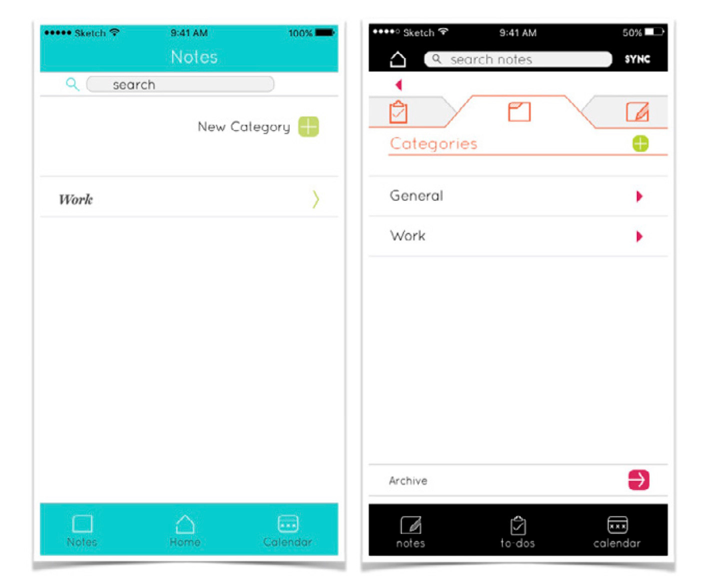
Audrey vs Joe : Notes Screen
Users were not happy with being forced to create categories for their to-dos & notes.
SOLUTION:
-Selecting notes, takes you to categories to encourage path. Or simply select the notes tab to add a not.
- A default folder labeled 'General' has been created to store any notes without a category.
- An archive at the bottom, for completed to-dos & notes which follows the same format as the category page.
Audrey vs Joe : Creating notes & to-dos
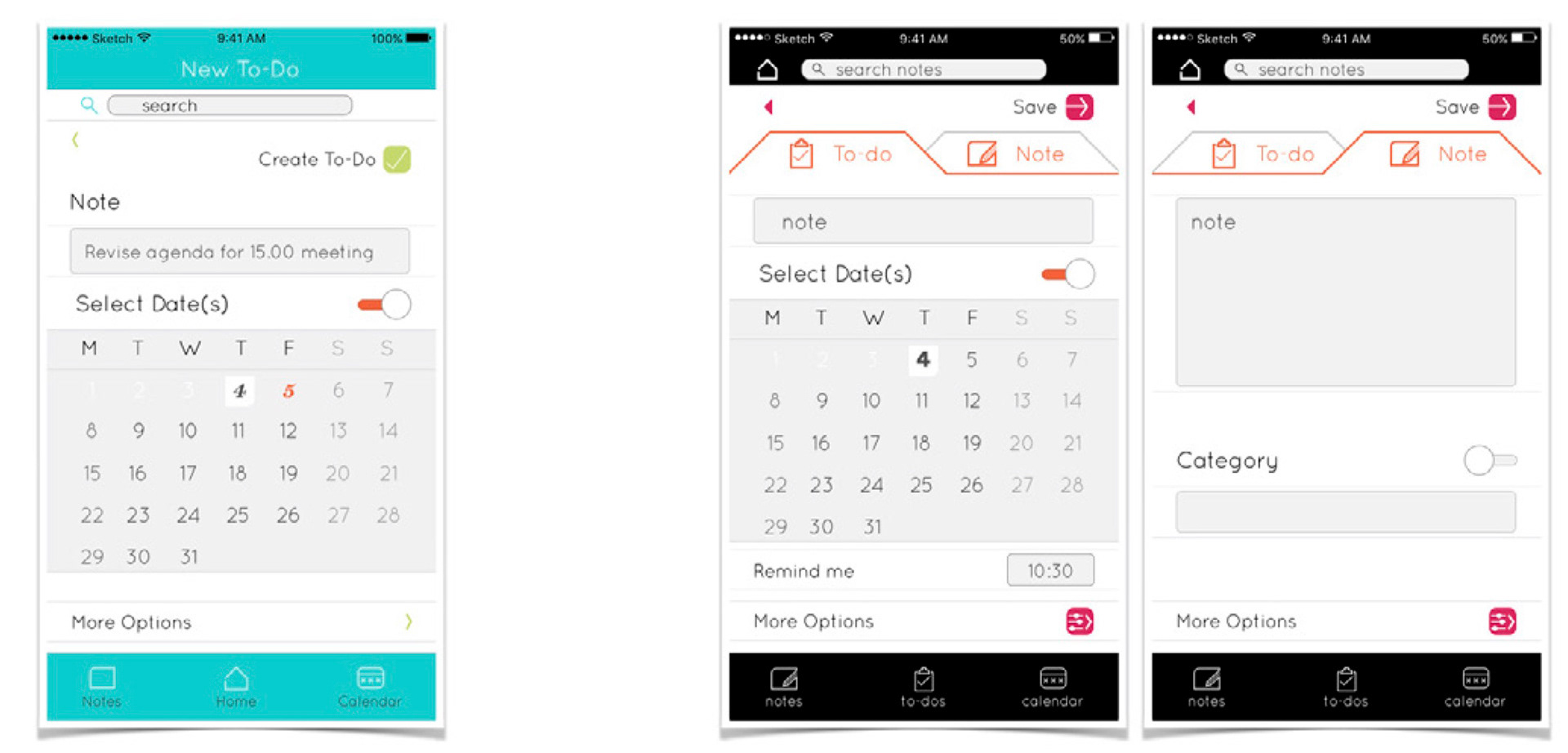
Audrey: Notes and to-dos were created the same way. - Differentiated by the idea (based upon user research), that "a note is a reminder without a time limit". This was not clear enough obvious.
Joe: Created an easy switch between the two. Based upon the theory that there is no reminder for notes. This should guide the user without making the decision for them. Also encouraging users to create categories, and reducing the number of steps to complete a task for efficiency.
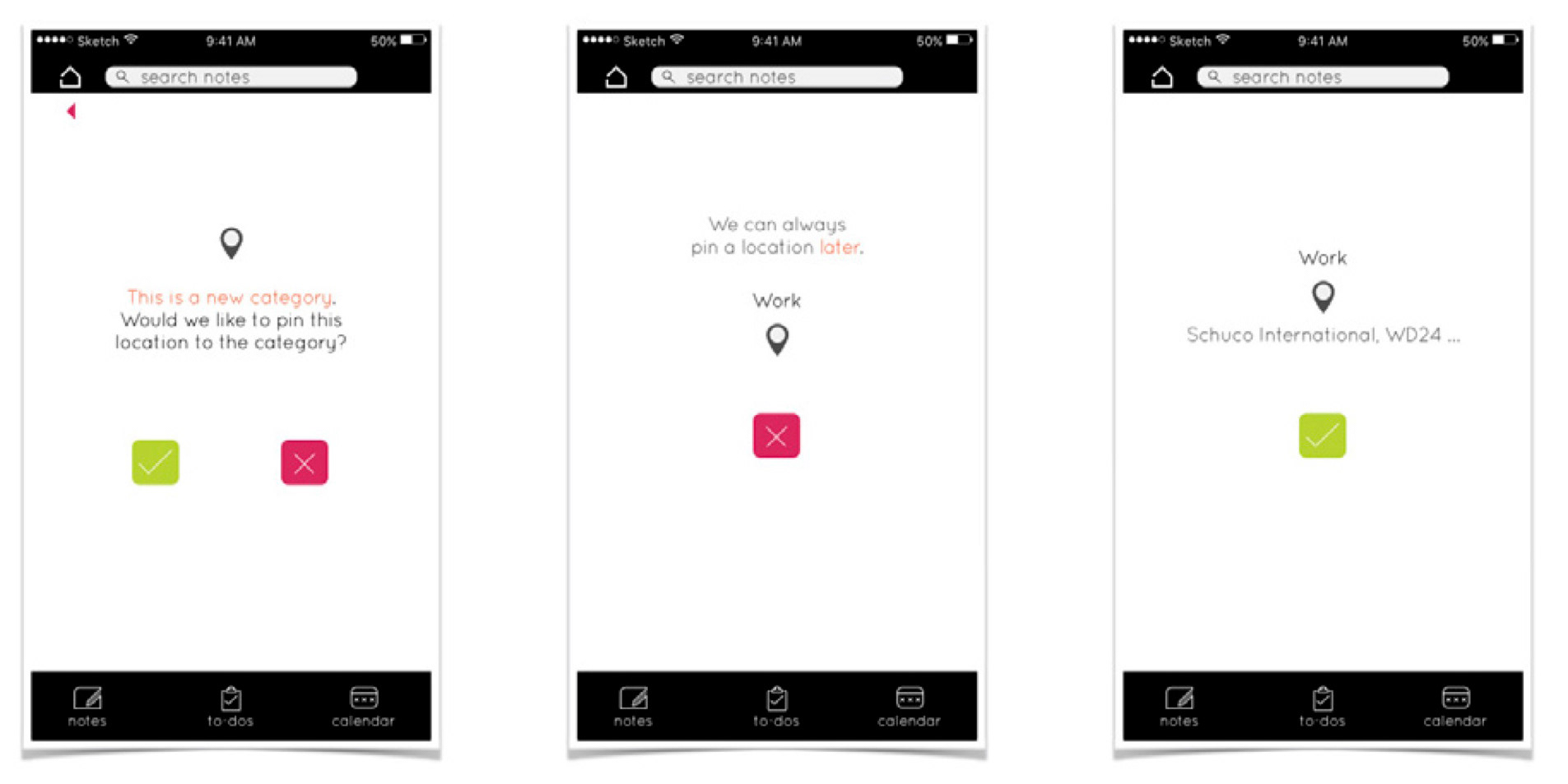
Audrey vs Joe : Encouraging the user to use features designed to increase efficiency
THEORY - TO BE TESTED
By making suggestions along the way, we hope to guide the user better. Though my aim is not to 'nag'.
Suggestions should be an optional feature located in the settings.