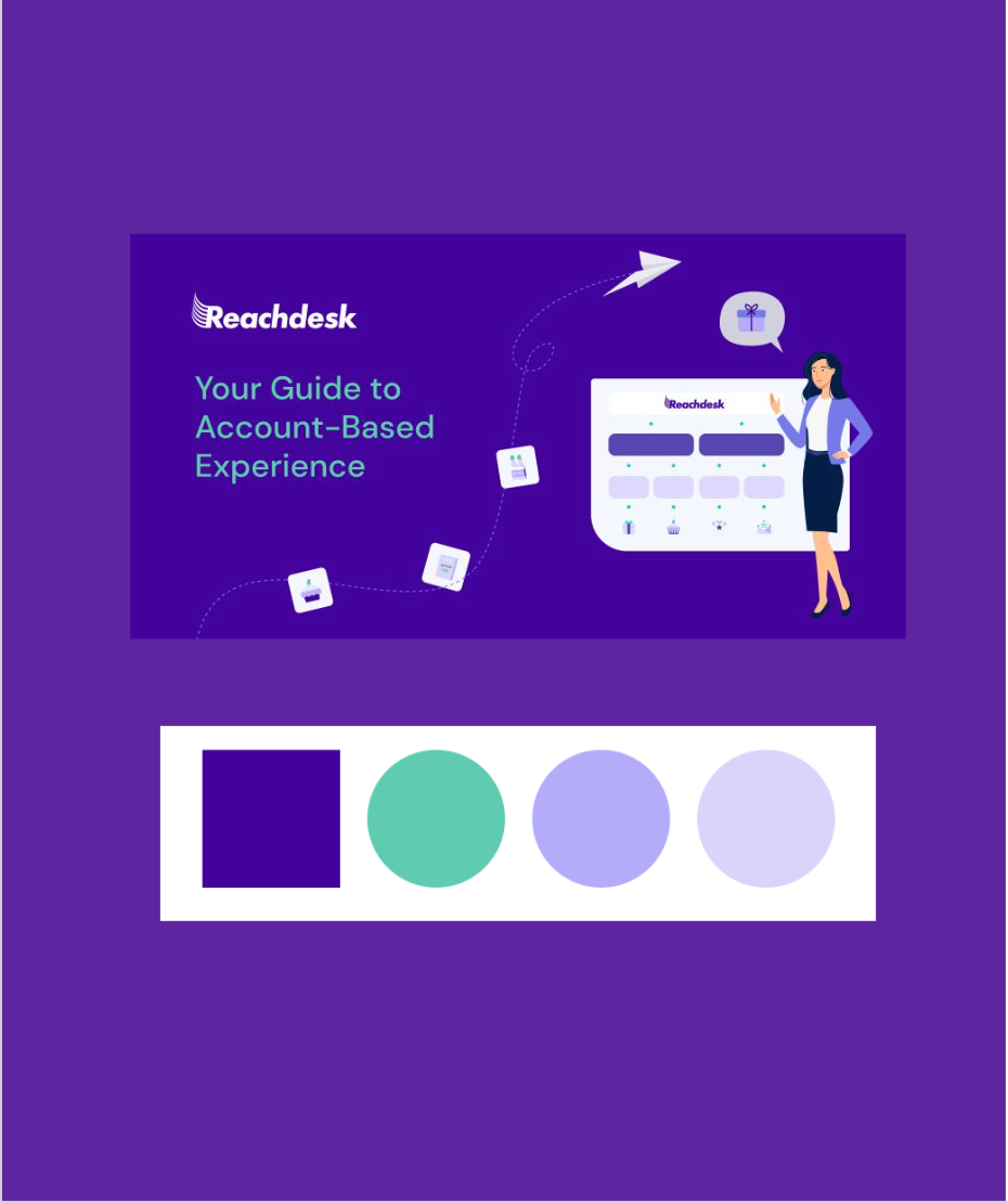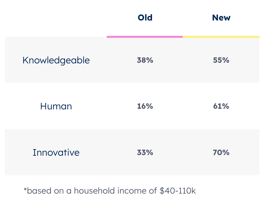


When I first joined Reachdesk, my first big project was a rebrand. The branding was made up of a collection of generic illustrations, a cold and corporate colour palette, and no real differentiating personality. This was stark different to the reality of the culture and values of the company. We realised that we were missing a trick by not reflecting our vibrant and energetic culture through the brand. The brief required that we keep the company colour purple, create a brand that can be differentiated from the rest of the tech world in a way that also reflects the company culture and values. We needed to modernise the brand. So the first question we asked was "Who is Reachdesk?" Through speaking to the leadership team, hearing form clients and conducting feedback from employees across the company, here are the key themes that were echoes across our research.


